A Journey of Restoration and Reimagining
Renovating a home that’s more than 100 years old doesn’t always mean simply restoring its original features – sometimes it’s more about undoing what’s been done over decades of ‘updating’ and remodeling, peeling back renovation after renovation to bring the house back to life. This was the approach taken by designer Melanie Love and Perez Construction in their work on an Edwardian home in Cole Valley, San Francisco.
Built in 1910, the house had great bones but had undergone many renovations over the years that had stripped away its character. The goal was to restore the original charm of the home and reconfigure the awkward layout to make it work for modern family life.
‘Previous remodels had left the style of the house lacking cohesion, and it was yearning for a sense of soul and better flow,’ says Melanie. ‘My brief was to revitalize the property and make strategic updates so it was more functional and suitable for a young family. The owners wanted a more functional, aesthetically pleasing space that felt more in line with the history of the home.’
‘Like many homes in San Francisco, some of the rooms at the center of the house lack natural light, so we thoughtfully chose paint and wallpaper to brighten up these spaces and create a visual connection to the outdoors.’
Both Melanie and her clients wanted to honor the home’s history while giving it a fresh personality, introducing rich color and bold pattern to complement the Edwardian features – so a neutral scheme was off the table. ‘Our client was really inspired by classic British design, with saturated color and pattern balanced by a mix of more modern furnishings – which is an aesthetic that aligns well with my own taste and our brand,’ she explains.
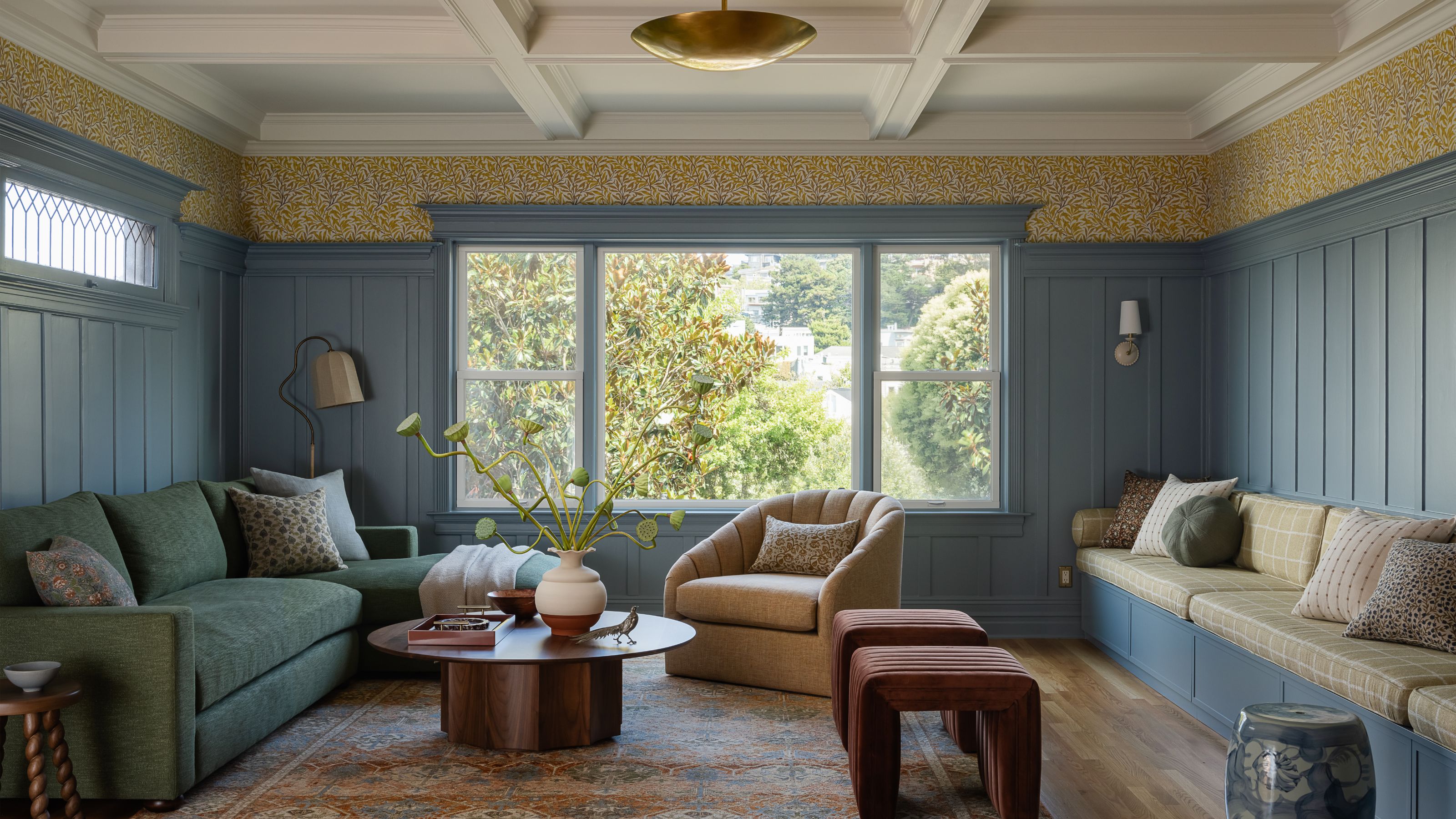
The Living Room: A Statement of Glamour
The living room was designed to feel like a special moment when guests first enter the house. To set it apart from the other spaces on this floor, a more glamorous light fixture and a more formal seating arrangement were chosen.
At the center of the room is a striking burl wood coffee table, surrounded by two swivel chairs and a classic camelback sofa. Creating a thread of connection between the rooms, the blue used on the kitchen island was also used for the wall paneling and built-ins. Inside the built-ins, a playful yet elegant touch of pink, echoed in the powder room and guest suite, adds depth and visual interest.
To keep this space family-friendly, performance fabrics were selected for the furnishings. The wood coffee tables and side tables throughout have an added conversion varnish finish for added protection.

The Family Room: A Relaxed Gathering Space
The family room seamlessly connects to the living room and offers a more relaxed, inviting atmosphere. The furniture layout is designed to accommodate larger gatherings while also providing a cozy corner for lounging with a book and space to play.
We also carried that same blue from the living room and kitchen island into the family room to maintain visual continuity. To add a special touch, a cheerful Morris & Co. wallpaper was selected, which introduces a playful yet sophisticated element. The yellow accent echoes the color palette of the upstairs kids’ bathroom, creating a cohesive theme throughout the home.
A simple brass pendant light echoes the shape of the ornate chandelier in the living room. Along one wall, a custom-built-in offers both ample seating for entertaining and discreet toy storage, making the space as functional as it is stylish.
The Dining Room: A Seamless Flow Between Indoors and Outdoors
Designed for a busy, entertaining-focused young family, the dining room leads directly through the heart of the kitchen to their backyard, making it a seamless flow between indoor and outdoor spaces.
Our client is passionate about nature-inspired motifs, such as flowers and trees. With this in mind, we sought a fresh interpretation of chinoiserie for the dining room and found that the scale and color palette of Cole & Son’s pattern were a perfect fit.
The dining room window frames a garden of flowering trees that change with the seasons, providing a dynamic, ever-evolving backdrop. The scale of the trees in the wallpaper perfectly suits the space, and our client loved the harmonious connection between the wallpaper and the shifting outdoor view.
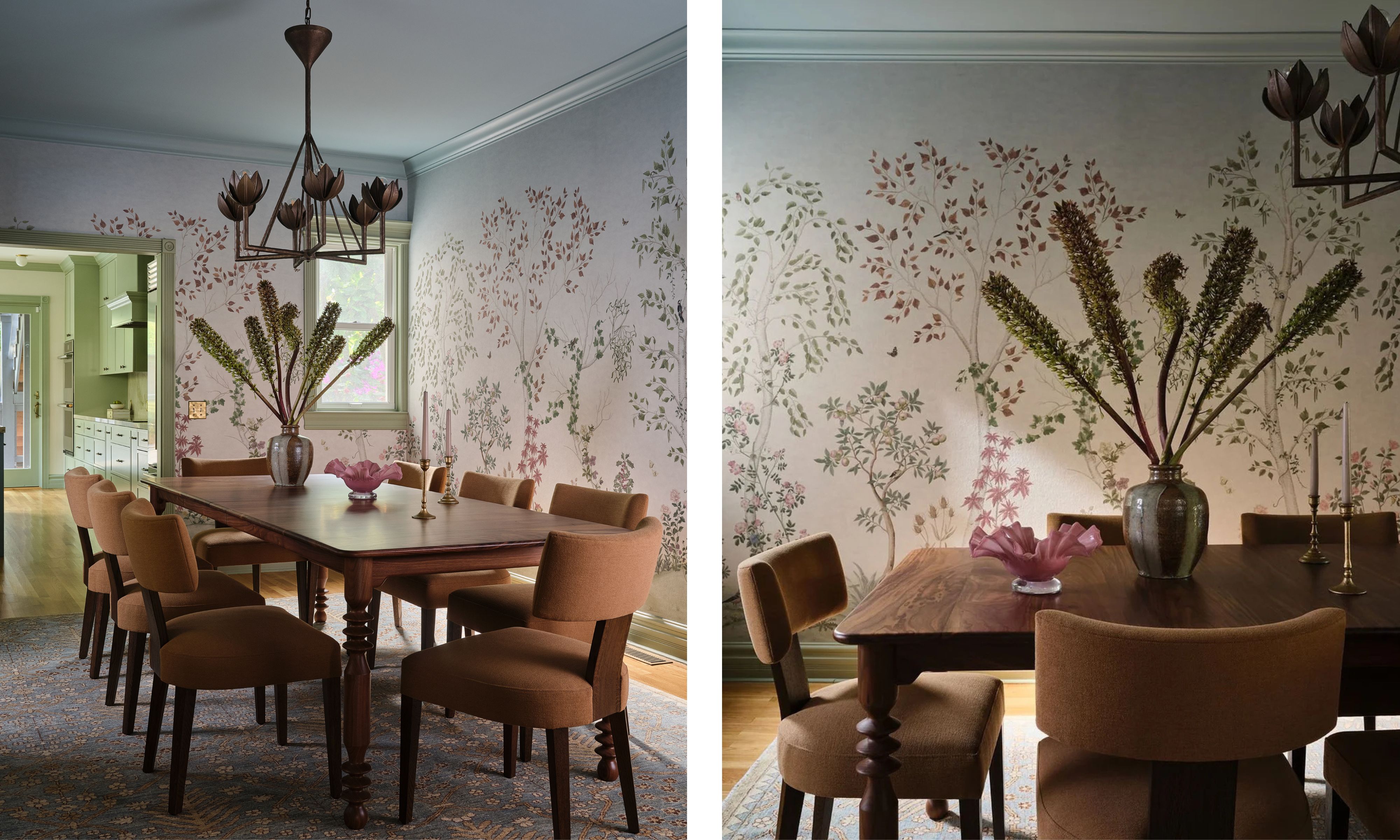
Our goal was for the wallpaper to be the room’s focal point, so we paired it with a complementary floral chandelier in a soft antique bronze to emphasize the immersive feel of the nature theme. The walnut dining table is custom-made and extendable for hosting large gatherings. We balanced out the cooler blue tones in the wallpaper, paint, and rug with the warmth of the walnut wood and earthy chair fabric.
The Kitchen: A Hub of Functionality and Style
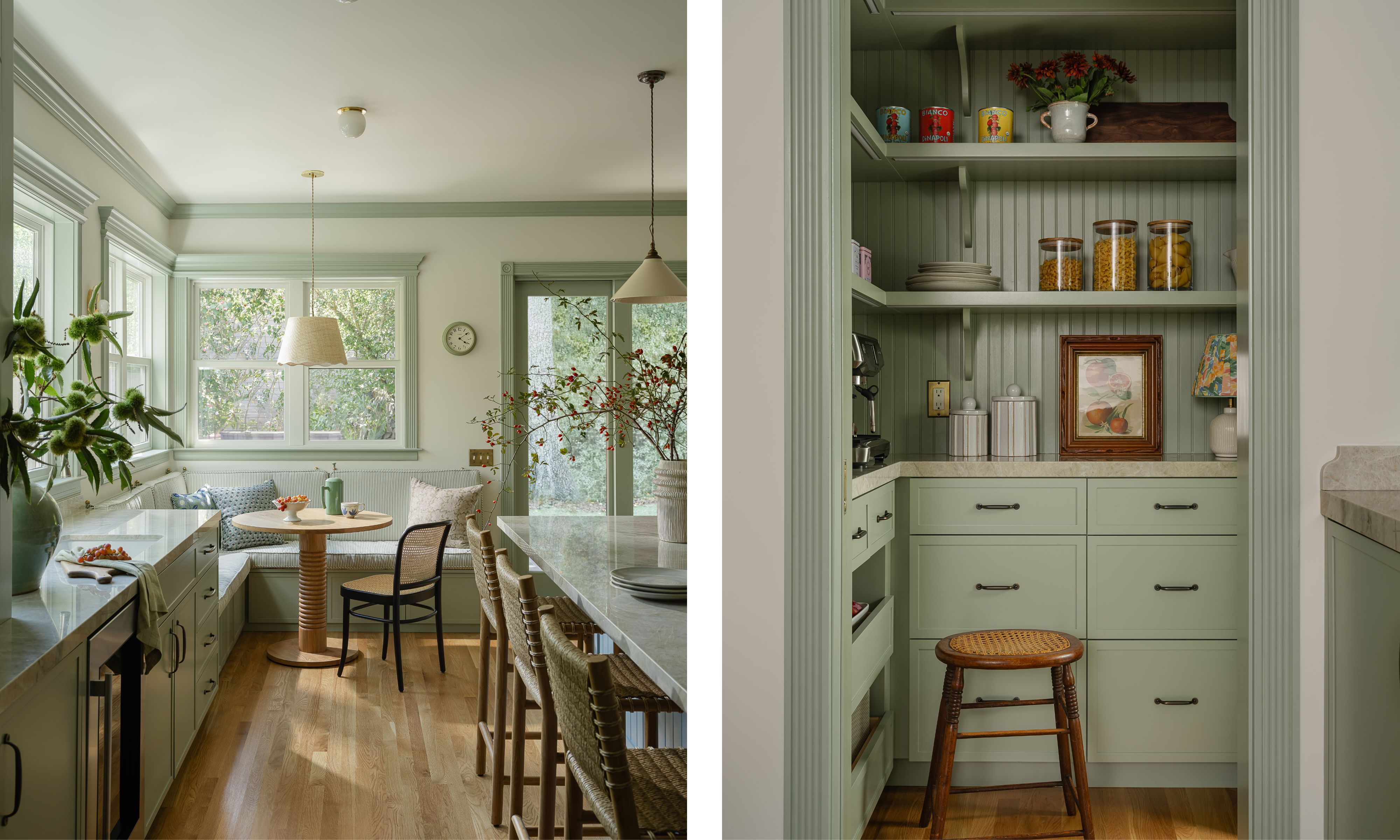
The design of the kitchen began with a focus on layout and flow. A large island anchors the space, flanked by cabinetry running the full length of the room on both sides. A secondary prep area, complete with a sink, provides a dedicated spot for tea and cocktail preparation, while nearby pocket doors cleverly conceal small appliances and supplies.
To maximize the space, we relocated the sliding doors and created a cozy banquette in the corner, featuring windows that flood the area with natural light. The banquette seating also offers additional storage as well as a cubby conveniently located for shoe storage near the back door.
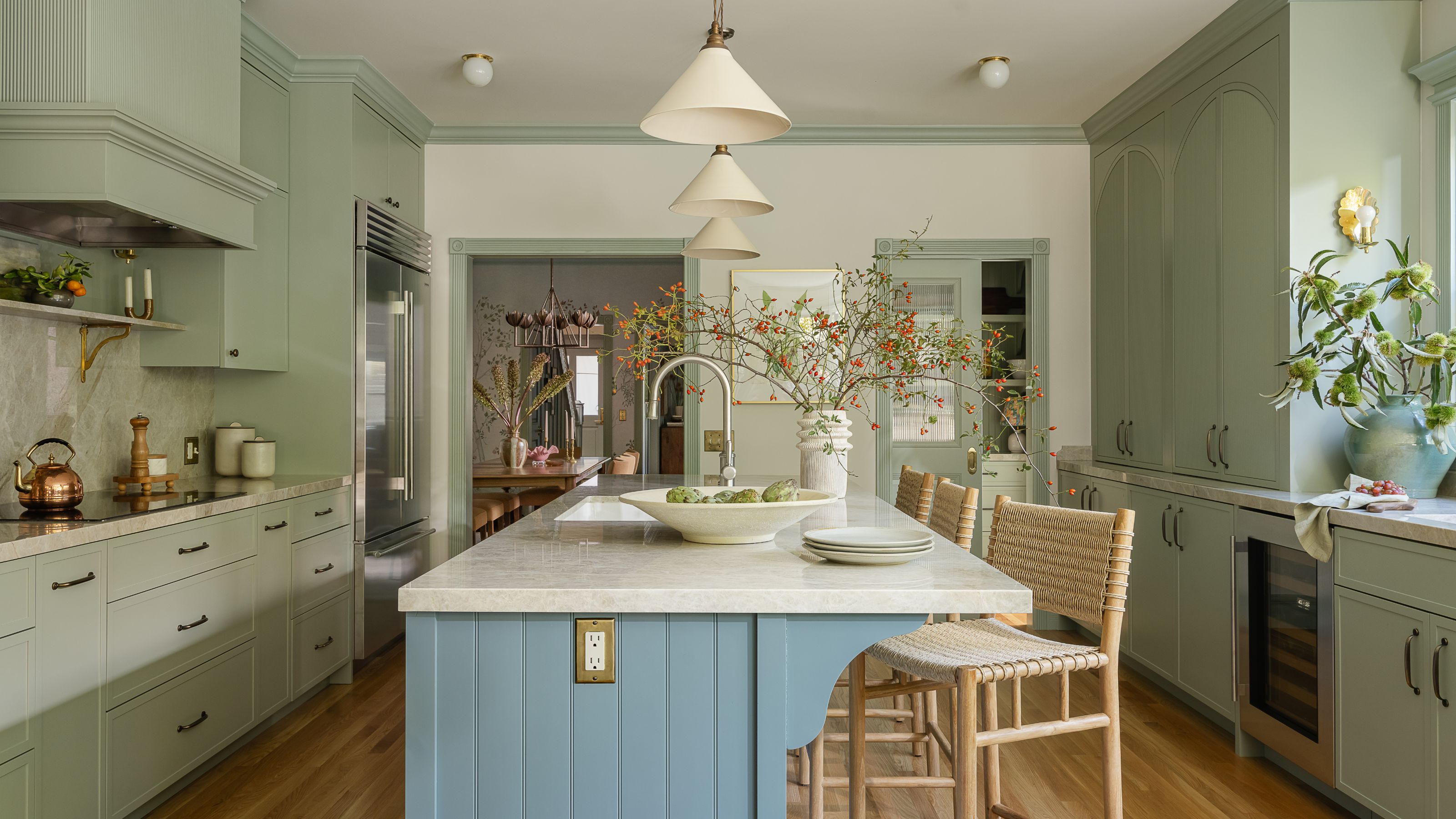
Color Scheme and Design Details
The kitchen color scheme was inspired by a soft sage green for the cabinetry, which sets a calm, yet fresh tone throughout the kitchen. To complement this, a vibrant yet serene blue for the kitchen island creates a striking contrast. The shade of blue is repeated on the living room and family room paneling. A lighter shade can be found on the dining room and pantry ceilings and in the ombre sky of the dining room wall mural.
Madre Perla quartzite countertops and backsplash add a stunning finish to the space. The lighting was carefully curated to include a mix of styles: ceramic pendants above the island, delicate scalloped brass sconces, and a larger scalloped pendant over the breakfast table. In lieu of recessed lighting, we opted for simple surface-mount fixtures to maintain a cohesive, clean look that didn’t feel too modern. For a bespoke touch, we incorporated fluted, arched details on the custom cabinet doors and attached the banquette cushion with brass hardware.
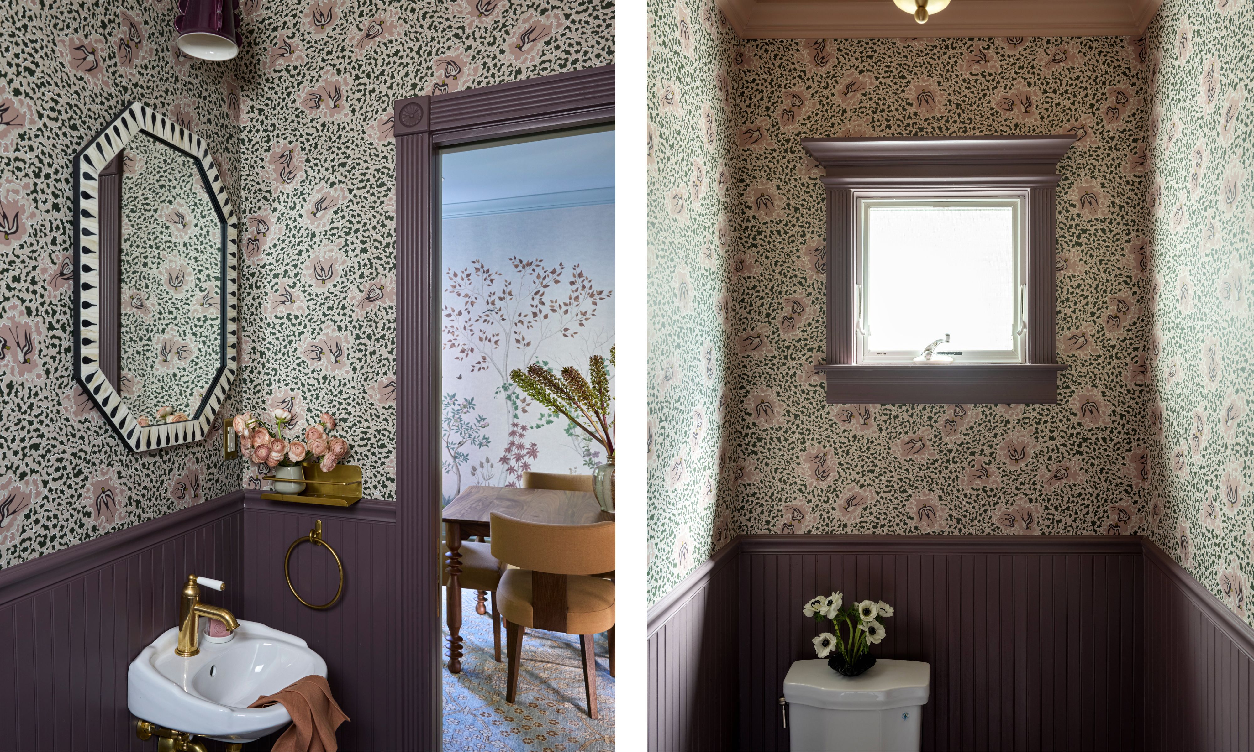
The Powder Room: A Jewel Box of Bold Patterns
Powder rooms offer the perfect opportunity to embrace bold patterns and striking shapes, and we took full advantage of that here. We created a jewel-box atmosphere with vibrant wallpaper, rich plum beadboard wrapping the room, a soft pink ceiling, and elegant brass accents. A custom ceramic sconce in aubergine complements the space, echoing the scalloped details that appear throughout the home.
The Primary Bedroom: A Serene Retreat
In the primary bedroom, we’ve designed a serene retreat with an earthy yet sophisticated color palette. Our intention was to create a unique atmosphere that distinguishes this room from the rest of the house. With an abundance of natural light, we embraced a bold, ornate pattern on the walls, adding a touch of grandeur.
Custom green-trimmed shades replaced the standard shades on the brass sconces. The soft curves of the shades are mirrored in the pendant light that anchors the center of the room. To maintain a sense of continuity with the first level, we brought in a shade of green for the built-ins and trim.

The earthy warmth of the wallpaper is complemented by the textured pendant and the woven bench at the foot of the bed. We also dressed up the custom daybed with a tailored skirt, adding a refined touch. The result is a room that feels truly special from the moment you step inside.
The Primary Bathroom: A Balanced and Functional Space
We reimagined the layout of the primary bathroom by moving the entrance to an adjacent wall. In place of the previous oversized tub, we added a spacious shower and a freestanding tub, creating a more balanced feel. These changes allowed us to incorporate a double vanity and reposition the toilet in a more discreet corner, optimizing both functionality and flow within the space.
We selected a soothing pistachio green as the foundation for a serene, calming color palette. Rare cristalo iceberg quartzite on the countertops, backsplash, ponywalls and shower niches adds a luxurious feel to the bath. The custom arched brass privacy screen between the vanity and toilet adds a bespoke, elegant touch to the space. One of my favorite details is the custom wood medicine cabinets – hidden behind the cerused oak mirrors, is clever storage that’s seamlessly integrated into the design.

The Guest Bedroom and Bath: A Boutique Hotel-Inspired Space
The space that delights me most is the guest bedroom and the adjoining bath. The mix of patterns and varying shades of pink in the floral wallpaper, fabrics, and tile makes my heart happy.
The guest spaces are inspired by the charm and luxury of boutique hotels. Designed to serve as both an office and a guest retreat, the room features a Murphy bed that effortlessly transforms the space into a cozy haven for visitors. The color palette draws from the guest bathroom's pink tones, creating a seamless connection between the two spaces.

Given the function of the room, we were able to be a bit more whimsical with a sweet floral pattern on the walls and a scalloped wallpaper border on the ceiling. At the center of the room, is a hand-sculpted light fixture with flower-shaped shades that echo the scalloped border. To complement this artisan light, we chose a painterly pink stripe for the drapery, enhancing the room's playful yet elegant feel. A cozy, custom pink sofa provides a lounging spot where they can enjoy views of San Francisco.
The Guest Bathroom: A Luxurious Hotel Experience
Our client envisioned a luxurious, high-end hotel experience for their guest bathroom. To set the tone, we selected a vibrant floral wallpaper that, combined with the large skylight, creates the feeling of being enveloped in a lush garden. Drawing inspiration from tile patterns in London’s boutique hotel bathrooms, we incorporated black tile trim to balance the bold pink, ensuring the design remains both sophisticated and timeless.
A custom medicine cabinet, cleverly hidden within the octagonal mirror, adds a surprising and functional touch to this elegant space.

The Kids' Bathroom: A Playful and Sophisticated Space
The striking Soane wallpaper serves as the focal point of the kids' bathroom, setting a vibrant tone. To complement the cheerful yellow, we extended the color onto the vanity and beadboard paneling that wraps the walls and tub.
Bespoke details on the vanity and quartzite stone backsplash add a touch of sophistication, balancing the playful color palette of this kid-friendly space. To maximize storage in this compact bathroom, we incorporated a train rack shelf above the toilet, providing a practical spot for extra towels during bath time.

This project is a lesson in how to honor a home’s charm, taking it back to its original beauty while also making it feel like a modern home, reflective of the owner’s style. The thread of blues and greens throughout every room gives this colorful home a cohesive feel; it’s bold but sophisticated and never overwhelming. The color scheme flows from room to room, slightly shifting but always connected.
‘We are thrilled with the end result,’ says Melanie, ‘and so excited to be working with our clients on phase II of the remodel.’