When it comes to selecting the right paint color for your home, the choices can be overwhelming. The right shade can set the tone of a space, influence how furniture and textiles look, and even affect how light is reflected in a room. However, with so many options available, it's easy to feel lost when trying to decide on the perfect hue. To help avoid common pitfalls, design experts have shared their insights on which colors should be avoided and what alternatives you might consider instead.
Stark, Cool Whites Are Too Sterile
White is a popular choice for wall color because it can make a space feel more open and airy. However, not all whites are created equal. Designers like Vanessa Larsson, an interior designer at Planner 5D, warn that stark, cool whites with undertones of blue or gray can create an unwelcoming and sterile atmosphere. These shades may work well in north-facing rooms with limited natural light, but they often feel flat and overly cold.
Instead of opting for these stark whites, Larsson recommends warmer alternatives such as Benjamin Moore’s Swiss Coffee or Sherwin-Williams’ Alabaster. These shades offer a more inviting and comfortable feel while still maintaining the airy quality of white. Natural lime or mineral paints from brands like Bauwerk or Graphenstone are also recommended for their non-toxic, breathable qualities and soft, velvety light reflection.
Millennial Pink Is No Longer Trendy
The peach-infused hue known as millennial pink was once a favorite among decorators, but it has since fallen out of favor. According to Larsson, this specific shade can flatten the emotional tone of a space and may date a room quickly. While it still works well as an accent, she advises against using it on full walls.
However, not all pinks are out of style. Warmer, more complex pinks can still be used effectively in a color scheme. For example, Benjamin Moore’s First Light is a pale pink that looks nearly white in certain lighting. If you’re looking for a salmony feel, the lighter Intimate White by Sherwin-Williams is a good alternative. These options provide a more sophisticated and timeless look.
If you still want to incorporate millennial pink into your decor, consider using it in small doses, such as a pink accent chair or wall art.
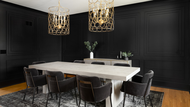
High-Gloss, Pure Black Is Hard to Pull Off
While black can be a dramatic and stylish choice, high-gloss, pure black is notoriously difficult to pull off in most homes. Anastasiia Amani, an interior designer at Big Time Studios, explains that while black may look chic in photos, it can absorb too much light and make a space feel closed in, especially in smaller or low-light areas.
Instead of going for pure black, Amani suggests choosing a deep charcoal with a soft matte finish, such as Benjamin Moore’s Kendall Charcoal. This option maintains the drama of black while softening its impact. It also pairs well with both warm and cool accents.
Before making a final decision, it’s important to test different shades by applying them in large swatches on several walls. Observe how they look throughout the day under different lighting conditions to ensure they meet your expectations.
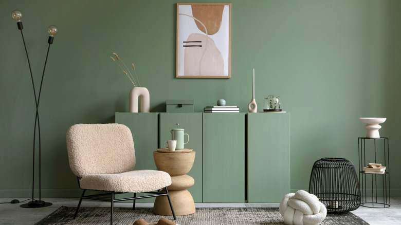
Neon and Electric Colors Can Be Overwhelming
Bold neon and electric colors may seem exciting at first, but they can quickly become visually exhausting. Anastasiia Amani notes that these intense hues can distort skin tones and make coordinating other elements of a room more challenging.
To avoid this, Amani recommends opting for muted mid-tones within the same color family. For example, instead of choosing neon green, go for a sage or olive shade. These options are less overwhelming and still add personality to a space.
Benjamin Moore’s Dry Sage is a versatile green that works well with various decor styles. If you still want to incorporate neon elements, consider using them in smaller, easily replaceable items like rugs, wall art, or decorative accessories.
Beige With Heavy Yellow Undertones Feels Outdated
Beige was once a go-to neutral, but it has started to feel dated, especially when it has heavy yellow undertones. Anastasiia Amani recalls that these shades were popular in the early 2000s but now tend to make interiors feel muddy and outdated, particularly under artificial lighting.
For a more modern look, Amani suggests choosing a warm greige (gray-beige) like Sherwin-Williams’ Accessible Beige. This color offers the neutrality of gray with the warmth of beige, making it a versatile choice that pairs well with a wide range of materials and furniture styles.
Cool Blue-Grays Feel Cold and Clinical
Icy blues are often used in spaces like nurseries and bathrooms, but they can make a room feel cold and clinical, especially if there isn’t enough natural light. To create a calming yet inviting space, opt for a balanced, soft gray with warm undertones. This type of shade avoids the sterile feel of icy blues while still providing a soothing atmosphere.
Benjamin Moore’s Pale Oak and Edgecomb Gray are excellent choices for creating a serene retreat. They are cool enough to avoid a dated look but have warm undertones that prevent a sterile feel. These shades also allow for the addition of pale blue accents, such as textiles or decor, to maintain the desired color theme.
Bright Red Shades Are Overstimulating
Vivid red is another color that should be approached with caution. Trina Rogers, owner of Five Star Painting, warns that bold reds can be overstimulating, especially in children’s spaces. They are also difficult to paint over later, often requiring extra priming and coats of paint.
Instead of using bright red on walls, consider incorporating it in small pops of color, such as throw pillows or decorative items. A scarlet accent, like an Amélie Home Knit Throw, can make a bold statement without overwhelming a space. If you want a larger splash of red, choose a more subtle variation like crimson or vermillion.
For those who still want to use red on their walls, consider using removable options like peel-and-stick wallpaper or wall art, which allow for easy changes without the hassle of repainting.
Bright and Pale Yellow Tones Are Hard to Pull Off
Bright or pale yellows can be tricky to use in home interiors. Angie Kreller, an interior designer at Yabby, explains that these shades can feel cold and washed out, especially if they have cool undertones. This kind of dullness is not ideal for a welcoming living space.
Kreller suggests opting for more ageless and versatile shades like white, beige, grays, and creams. Benjamin Moore’s Timid White and Sherwin-Williams’ Dover White are great examples of versatile neutrals that work well with a wide range of furniture finishes.
If you still want to add some warmth, consider using accents in canary yellow or saffron to bring out the undertones of your chosen shade.
Avoid Overly Trendy Shades
Trendy colors can be tempting, but they often don’t stand the test of time. Angie Kreller advises avoiding anything that’s newly popular, as these hues may clash with your current decor and require a major overhaul down the line.
Instead of following trends, stick to a neutral base for your walls and use decorative accents to bring in trendy colors. Textiles, art, and plants are great ways to incorporate these hues without committing to a full paint job.
For example, if a trending color like Behr’s Hidden Gem appeals to you, consider adding it through affordable accessories like a decorative pillow or canvas prints. This allows you to enjoy the trend without the long-term commitment.