Joanna Gaines has a knack for picking kitchen colors that feel timeless and welcoming, with certain color combinations that she uses time and again for successful results. Looking at your kitchen with these colors in mind can give you fresh ideas. A simple can of paint can transform your space, or you may end up with multiple colors in mind for your next kitchen facelift after seeing how Gaines uses colors in her kitchen.
She tends to choose colors that make her feel at home and ones that are found in nature, while avoiding those that make her feel anxious. So, when you think about the colors you want in your kitchen, it's good to think in terms of the ones that are going to inspire you to spend time in your kitchen and ones that are timeless. Specifically, you want to think about how you want your kitchen to make you feel, and work off of that feeling when choosing colors. Some of her more bold color choices may invigorate you, while some of the more muted tones may give you a feeling of calm.
Gaines actually has a line of paints called Magnolia Home by Joanna Gaines that features all her favorite colors. We've mentioned many specific colors from this paint line to give you a solid idea about the shades she prefers. We hope that, when you take a look at the colors and kitchen color schemes Joanna Gaines likes, you'll find one that inspires you.
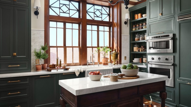
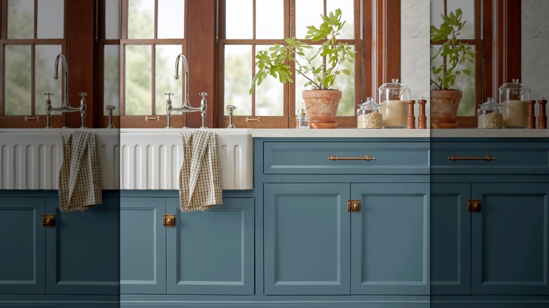
Nature-Inspired Green with White
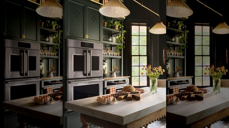
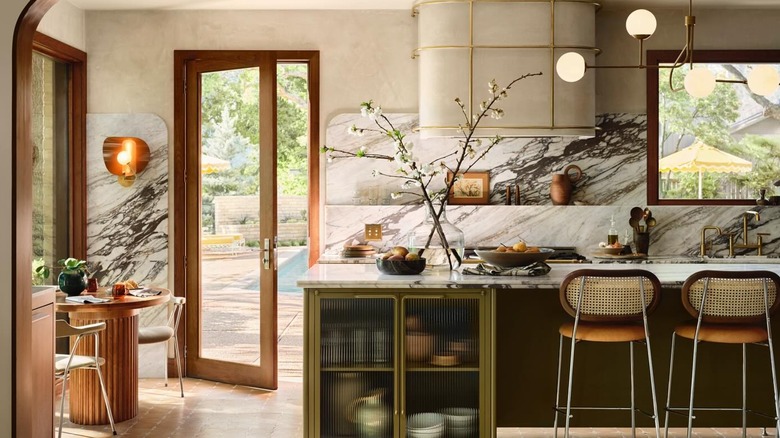
Some of the nature-inspired colors that Joanna Gaines has been using recently have been a variety of greens, which she often pairs with white. It's a way to bring a little bit of the outdoors indoors with your kitchen color choices. Gaines is especially fond of using earthy colors to create kitchens that won't go out of style. She has been using all sorts of green everywhere lately. In 2024, she told House Beautiful that she likes the emotions that moody and vintage greens evoke.
Don't limit yourself to just using green on the wall, as it also makes a striking color for cabinets. Green cabinetry with white countertops is an especially striking choice that's becoming more popular. Greens also pair well with natural wood accents. However, it's white that really pops as a contrast color. With natural light coming in from a window, the white practically glows, while the greens and wood tones match the world you can see through your window.
Gaines especially likes using Magnolia Green from her Magnolia Home paint line in her kitchen, which is a classic bright green that she finds to be evocative of early spring when everything is just about to bloom. Another of her favorite greens, Remote Trail, is an earthy color green color she loves to use, which conjures memories of the earthy greens you find while spending time in the woods.
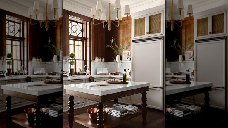
Creamy White with Natural Wood
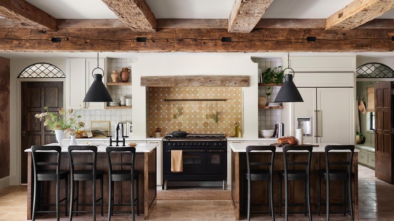
Joanna Gaines combination of creamy white with natural wood makes any space feel light and airy. It's a timeless combination that will look as nice today as it will in a couple of decades. This color combination looks great in a farmhouse-style kitchen, which Gaines is helping to make a comeback.
If you've had a chance to watch Gaines' cooking show, "Magnolia Table," you've seen this color combination in action in her set kitchen. Her chunky stone walls are painted white. You'll also see white on her farmhouse sink, marble countertops, hood range, pots and accent pieces. Meanwhile, the cabinetry shelves, island, and floors are all natural wood. Granted, Gaines likes to add other accent colors as well. For example, in the kitchen she updates in "Fixer Upper" season three, episode 16, she includes a black tile backsplash and Magnolia green light fixtures to go with her white walls, white countertops, and natural wood cabinetry. So, don't feel like you have to get stuck with something that feels completely monochromatic.
And don't forget that your white doesn't have to be bright white. While Gaines does have a True White color in her line, she also has ones that lean beige, like One Horn White; ones that have a hint of brown like Soft Linen; ones that have honey undertones, like Lit Candles; and ones with grey tones like Cloudy Gray.
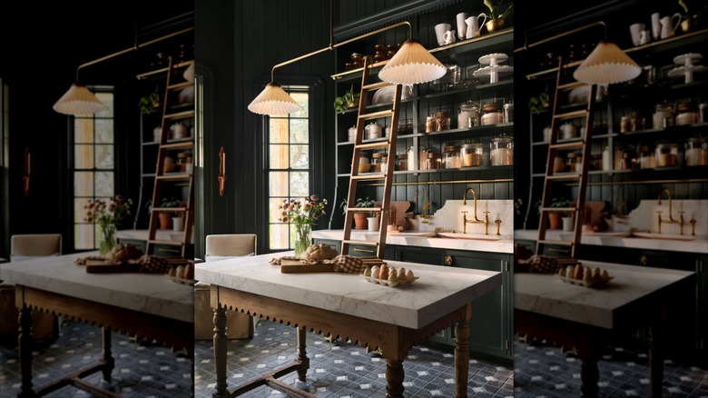
Light Shades on the Top, with Darker Shades on the Bottom
It's a well-known trick to open up smaller kitchens with light colors, but Joanna Gaines takes it a step further by pairing lighter top paint shades with darker bottom colors. One thing we love about Joanna Gaines' kitchens is how she uses contrasting colors, and strategically-placed contrasting colors like this creates the illusion that your kitchen is larger than it really is.
The placement of the light and dark colors matter. Essentially, everything at eye level — starting at your countertops — should be a lighter color to bounce the light back to your eyes and make everything feel bigger than it really is. So, you'll want lighter colors on your upper cabinets and shelves as well as your backsplash and walls. However, below the countertop is where you'll opt for darker colors, to give it more dimension and intimacy. In fact, it seems to us that the darker colors almost disappear, making the bright top colors all the more bright.
In keeping with Gaines' color schemes, you'll want to go with earthy, nature-inspired colors on both the top and the bottom. Go ahead and choose creamy whites, light greys, and light greens for the top. However, for the bottom cabinets, you'll go with colors that create depth, like deep greens, darker blues, or darker greys.
Cottage Grove and Castle Cream
Speaking of contrasting colors, one of Joanna Gaines' favorite contrasts is Cottage Grove with Castle Cream. This light and dark color combination is one that you can use in any sized kitchen, not just when trying to make a small kitchen look larger. While this color duo is a riff on the nature-inspired green with white theme Gaines likes, it's a very specific pairing that you can latch onto without having to agonize over which shades of green and white look best together.
In 2025, Gaines confirmed to House Beautiful that Cottage Grove had started to become one of her go-to colors, and it looks especially nice in kitchens. The interesting thing about this color is that it looks different in different light, looking like the darkest blue, deepest green, or dark grey depending on the light sources available for your kitchen. It's a better choice than a dated hunter green since it's a more timeless and nature-inspired color. Despite being dark, it's a peaceful color that works with a multitude of contrasting colors you might have in your kitchen. It looks especially nice on cabinetry but works well on walls and backsplashes as well.
A light color that contrasts very well with Cottage Grove is Castle Cream. This Castle Cream color looks beige in some lights and more grey in others. It's headed toward white without actually being white. So, it stands out if you have any white accents like white countertops. It also looks nice with natural wood accents and cabinetry.
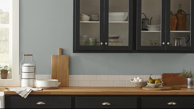
White and Black
One color combination Joanna Gaines likes that never goes out of style is black and white. It's going to look just as relevant in the decades to come as it does today. Plus, it's going to match any colored accessories you find and switch out over the years, whether it's your favorite color Kitchenaid mixer, dinnerware collection, or seasonal decor.
There are lots of ways to combine black and white in the kitchen. An enduring look is pairing a white wall with black cabinetry. Gaines has shown that the white wall doesn't necessarily have to be painted but can also be in the form of a white subway tile backsplash, which is what she did in her own farmhouse kitchen. There, everything was white except the black countertops and light fixtures. We've also seen Gaines do all the cabinetry and walls in black and rely on marble countertops and white canisters in her cabinets to provide a pop of white.
However, the black can be a subtle element as well. In season 2, episode 11 of "Fixer Upper", Gaines created a kitchen that had white cabinetry and appliances with a black countertop and black light fixtures. The black and white element was still there, but it didn't scream "black and white kitchen" nearly as much since the kitchen wall remained brick and the island had a wooden countertop. One black she's told interviewers she uses a lot is dark black Blackboard, which looks extremely striking alongside white.
Dark Blue and White
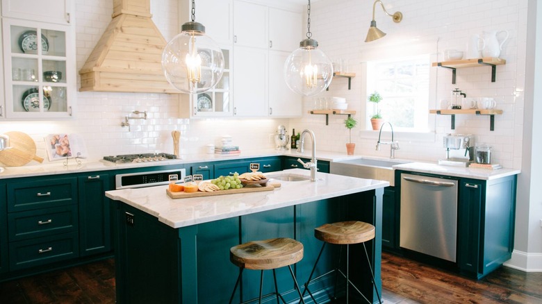
Dark blue and white seem a little less earthy than some of Joanna Gaines' other kitchen combinations, but they're still colors found in abundance in nature. It also turns out that choosing a single bold accent color like a striking shade of dark blue can make your kitchen look more sophisticated.
It's a good idea to keep the walls a neutral white when opting for blue elsewhere. In kitchens like the one Gaines designed in "Fixer Upper" season 3, episode 13, she often goes for white from the countertops up, which gives even larger rooms an open feel. Then, a moody dark blue grounds the room from its place on lower cabinets. However, we've also seen her mix lower white cabinetry with lower dark blue cabinetry and incorporate blue into the backsplash tile design. As we've mentioned before, it's not uncommon for Gaines to use white subway tiles for her backsplash and walls, and she's been known to do this in her blue and white kitchens, too. Plus, natural wood accents in the shelving, stools and stove hoods, and you've got Gaines's style.
Gaines has a lot of deep dark blues in her paint line. She has told interviewers that some of her favorite blues are deep and moody ones. One color that she has used over and over is Weekend, which is a vibrant yet moody blue inspired by denim.
Grey and White
Speaking of stormy seas, another color scheme Joanna Gaines likes to use is a palette of grey and white. Not only does she go for dark grey and white, but light grey and white seem to be a favorite combo as well.
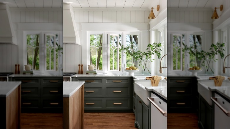
Gaines has used grey and white in multiple kitchens. In her castle kitchen she paired Castle Cream on cabinets with the white of marble countertops. Plus, she has lots of deeply brown stained accents in the room. Here, the Castle Cream feels more light grey, keeping the room feeling cozy in contrast with bright white. In her Hillcrest Cottage kitchen, she uses light grey again on upper and lower cabinetry with white marble countertops and a white subway tile backsplash. In this case, it helps to brighten an otherwise small and windowless kitchen without going all white. We've also seen her mix dark grey, light grey, and white. For example, you might see white on walls countertops, dark grey on the cabinetry, and light grey as a backsplash color.
Every shade of grey goes great with bright white. However, if you're trying to pair two paint colors together, the trick is to pair two that have some of the same undertones or use one that pairs with practically any white. One grey color Gaines likes is Garden Trowel, based on the actual color of a garden trowel. It's a warm color she's mentioned in interviews as being among her favorite neutral grey colors.
Light Blue or Light Green with White
If you want a little more color than grey and white, you can opt for a light blue or light green with your white instead. Depending on the color shade you pick, it can give your kitchen a classic feel or it can be a modern choice that you can change with your mood over time. Still, you're picking colors from nature, but think of it in terms of the calm blues, greens, and whites you'd see in nature rather than bright tints.
Gaines' tends to go in two different directions when it comes to using light greens and light blues in kitchens: earthy or beachy. When she remodeled The Lakehouse kitchen in "Fixer Upper", she went with a light green called Remote Trail that feels like a mix of green and light brown. In this case, the light green color felt more earthy. However, she's also chosen light blues and light greens that give kitchens more of a beach feel paired with white. This feeling is intensified when you combine it with light-colored wood accents.
We've noticed that a lot of Gaines' favorite light blue and light green colors straddle the lines between blue, green, grey, and brown. Gaines has told interviewers that one of her favorite pastels is the moody greyish blue Rainy Days, which she has said is a color that reminds you the sounds and smells of a rainy day, making you want to stay home.
A Dark Color, a Pastel Color, and White
If you're looking for something bolder and moodier, you might be drawn to Joanna Gaines' mixture of dark, pastel, and white colors in the same space. The addition of a dark and bold color to an otherwise light-colored kitchen can elevate the space and give it a lot of personality.
When using dark colors in a room, Gaines likes to use lighter colors to add balance. Although, she does like to use a different color on trim to make the transition from a dark wall to a white ceiling not feel so drastic. Plus, the lighter colors make the room feel more comfy and less formal. One example that we like a lot is a kitchen where Gaines painted a kitchen's brick wall with a deep blue-grey color called Coffee Nook, used a blue-grey color called Clean Slate on the cabinets, and went with a white countertop and sink. The synergy between these colors brings a lot of personality to the room and works great because it's a room that already has a lot of light.
The trick is to choose a dark color that is deep and rich, and pick a nature-centric light blue, green, or grey that looks nice with it. Every color combo has its own feel. We especially like the smokey dark grey of Prairie Smoke with the muted blue-green mintiness of Texas Summer. Another great one is the dark peacock blue of Under the Stars used in conjunction with the moody bluish-green grey of Morning Calm.
White and Cream
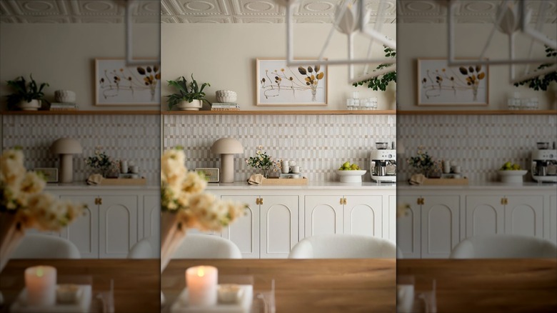
Finally, we have Joanna Gaines' idea of putting white and cream together when painting a kitchen. If you really want a kitchen that's bright and as light-colored as possible, opting for both cream and white means that you can still play off of contrasts. The white and cream combo will never go out of style and is infinitely versatile. It's also simple, which allows you to take your kitchen in any style direction and change your color scheme on a whim simply by changing your decorative accents.
Any cream pairs well with white. So, pick whichever cream you like best for the accent. You can even go with two different shades of white or two different shades of cream. If you choose white marble countertops, white sink, and white trim, all you really have to do is pick another contrasting white or cream to go with them. Gaines also likes to pair natural wood with cream, which helps to bring out warm tones in the cream color.
The choice of how to mix your creams and whites is up to you. Get some paint swatches and hold them up side by side until you find the combination that makes you happiest. One shade of white Gaines is notorious for using over and over again is Shiplap, which is an antique white that features both cream and grey undertones.